Crafting beautiful designs and compositions will get you far in life. It will get you extra far on the Internet.
I never took a true design course in college. I took one Art History class where I learned worthless crap (artist names from the 15th century) and important CRAP (Contrast, Repetition, Alignment and Proximity, which is more helpful than memorizing 15th century artists) and that’s about it. Everything I’ve learned has been from the Internet, conversations with friends and examining quality design.
I love designing invitations, advertisements, t-shirts, thank-you cards and documents.It’s a skill that anyone can develop and it’s one that will pay serious dividends in the way of cost savings from doing your own work instead of hiring it out and could bring in some cash if you’re good enough to do some freelance work on your own.
There are unemployed designers people who have doctorates in Art Hisotry who may disagree with what I say below. They’re totally entitled to their opinions that they paid someone else too much to develop for them. This stuff works, trust me.
**Without further ado, practically everything I know about design that will carry you down the road of being a self-made designer.
**
1. Less is more.
If you learn nothing else here, remember this tip. Just because you have the space doesn’t mean you should fill it with cats and every possible detail about your event, organization, or blog.
2. White space is the best space.
White space is a beautiful thing. It’s not just about leaving more space, but it’s about leaving space so we can actually read what the heck you’re trying to communicate.
3. Alignment is key.
Don’t center everything. Challenging, I know, but trust me, it will make your design stand out. Align edges, align the top and bottom, equally distribute information, but don’t center everything.
Also, use a grid display (View > Grid, in Photoshop) on your document to make things easier to align. Use grids, love grids, work grids to master alignment.
4. Admire quality work.
Decide why you like a certain advertisement or blog. Analyze everything about it. Take note of the minutest detail. Discover what makes something special.
5. Follow good designers and blogs.
A few websites and designers that have inspired me lately:
6. Google for inspiration.
Making a logo? Search awesome simple logos. Pretty much fill in the blank of logos with anything you’re making: shirts, invitations, websites, whatever.
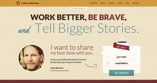
7. Save your inspiration to Evernote.
Every time I encounter a blog element or design I like online, I screenshot the web page and throw it into a new note in Evernote that I tag under inspiration. When I’m procrastinating and screwing around with my blog design instead of doing the real work of writing, I look through the inspiration and start playing with my blog to replicate the look. Here’s an example of Chris Brogan’s landing page that I really like.
8. Find free resources.
I use free logos in my design work from sites like iconmonstr.com. There are tons of other sites that offer similar things. Just make sure you’re obeying licensing rules.
9. Get friendly with Photoshop.
This isn’t necessary in the short-run, but long-term it’s practically impossible to keep Photoshop out of your toolbox. Avoiding Photoshop is like being a carpenter and trying pound nails using a 2×4 instead of a hammer. It might work, but it’s going to wear you out.
Right now, Photoshop Elements is around $60 on Amazon and you can download it instantly (affiliate link, there). It’s easier to use than the normal, more expensive CS6 version of Photoshop, but you can do a ton with Elements. Yes, there are other free programs you can use, but I promise it’s worth the marginal investment if you’re even moderately serious about design. Buy it today.
It’s going to take time to feel comfortable using Photoshop. Throw a picture in there and start clicking on tools and dragging around until things happen. Learn the keyboard shortcuts–they will save you tons of time. Once you get familiar with the basics, search for free Photoshop tutorials.
10. Follow a color scheme.
You don’t even have to be good at color coordination yourself. Just use Design Seeds or COLOURlovers and find a good set of complimentary colors. Screen shot those colors (shift-cmd-4, on a Mac) and drag them from your desktop into Photoshop. Leave them in your document and just rock the eyedropper tool to snag the color while you dabble with your newly acquired paint palette.
11. Remake something you see online.
Good artists copy, great artists steal. – Pablo Picasso
Start with copying, move on to stealing. Try to find a simple image and just recreate it on your own in Photoshop.
12. Flat is in style.
Believe it or not, simple, two-dimensional design totally works and is even in style now. Low effects, nothing fancy. Don’t worry about lighting effects or 3D text. Maybe add some blur if you’re feeling crazy, but crisp, clean, aligned design with lots of white space will get you super far.
13. Get familiar with typography.
Typography is the rich man’s word for how letters look. You can spend your whole life learning typography, but here are a few basics. The fonts you choose matter, and different fonts convey different emotions. Don’t neglect the importance of text style.
Here are a couple terms you’ll see regularly: serif, sans serif, monotype. Sans serif fonts don’t have fancy styling and hooks on the letters–they are more simple and crisp. Serif fonts have more styling added to them with hooks and curly q’s. Monotype means each character gets the same amount of space, wither it’s an i or a w. Think of it as the communist font spacing.
Everyone used to say serif should be used in print work and sans serif should be used on the web, but that’s pretty much all made up. In general, you can’t go wrong designing practically anything with sans serif (like this entire blog and all of my examples).
14. Download good free fonts.
Now that you know about typography, set dafont.com and <fontsquirrel.com> as your homepage. Look at the most popular to see what’s hot.
I’ve listed a few of my favorite fonts below. A few of the paid ones should come standard on your computer. Don’t pay for Fonts when you’re starting out (or even when you’re good). The free fonts offered are solid.
Free
Paid
15. But take it easy on the fonts, big guy.
Having good fonts is important. Using all of your good fonts in one document is a nightmare. I’m partial to using one or two fonts in an entire design. The more fonts you use before you know how to use them, the worse your design will look. Even if you know what you’re doing, don’t use more than two fonts.
16. Web and print are not created equal.
The font size on my blog is larger than most websites, and it’s larger than the font in a book or a magazine article. Why is that? Because it’s easier to read and it doesn’t cost anything to make it larger. The thing about print is that more pages costs more money. On the web, there’s no page length limit. Keep this in mind when you’re designing. What should only be one page in print can be as many as you want on the web.
17. Throw text on a sick picture.
This is ridiculously easy and an awesome gateway drug to design. Here’s an example for an upcoming retreat for our ministry.
If you have a good picture, throwing text on it and lining things up is super simple (especially in Photoshop where you can select things and align their edges or distribute equally with the click of a button).
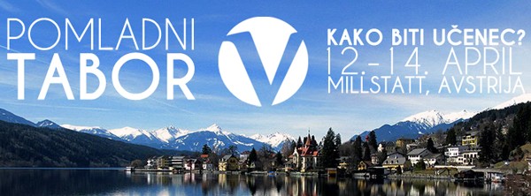
18. Make mistakes.
You’re first designs will be sucky. That’s ok. Mine were too. Exhibit A: a blog header from the past.

Yikes. This hurts my spleen. It’s awful. Some day, I’ll think my current blog design is the worst ever, but it’s a progression. You don’t ever arrive in design, it’s a continuum of improvement that you grow in.
19. Resolution is important.
Here’s the shortest lesson you’ll ever learn in resolution: make something way bigger than you need to and then shrink it. If you do the opposite, it will be blurry and awful and puppies will die.
A bit more details on this: the more dots (DPI or dots per inch) the larger something can be without becoming blurry. So, when you set up a new document in Photoshop, set the DPI to something really high (like 300 dpi) and then if you scale it down or use it on the web, you can easily scale down.
20. Simple shapes go far.
Practically everything I design is a smattering of triangles, circles, squares and lines. Like this bake sale slide advertisement I created to encourage people to buy donuts for international students to get scholarships to our ministry retreat.
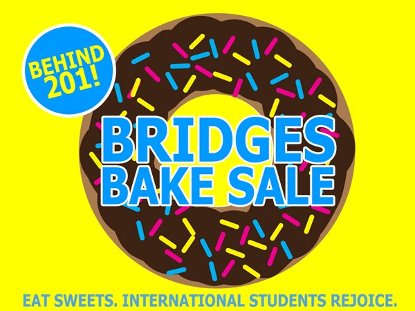
I like the way this came out because I like donuts and simplicity. It’s a bunch of circles and rectangles with rounded corners–shapes that all come standard in Photoshop. Super simple, but effective.
21. Proximity makes sense.
Put all the related elements and information together. You are now a proximity expert. Don’t put your phone number in one corner with your country code in another. That’s an exaggerated case but that’s the quick and dirty of proximity.
22. Rinse and repeat.
Repeat colors, repeat style, repeat themes. The more you repeat similar elements, the more it feels like a congruent work.
23. Contrast is simple.
Don’t put black font on a black background. Fill in black in both of the previous instances with any color. Don’t do that.
24. Get comfy with your undo keyboard shortcut.
Cmd-Z. Use it frequently.
25. Don’t get CRAZY funky with font styling.
If you bold, underline and italicize everything, you’ll break the Internet and you effectively emphasized nothing.
26. Follow the theme.
Here’s a basketball advertisement I made. The top font I used reminds me of writing from a scoreboard.
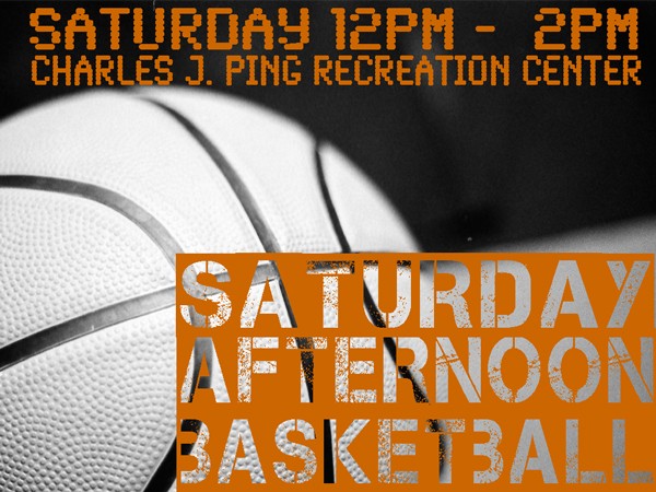
I’m not brilliant, I’m just practical. Connect things that work well together.
27. Ask for feedback.
Tweet your work, post it on Facebook, as a design-minded friend for suggestions. My wife has a great eye for design so I often ask for her input when I’m working on something. You have to put your work out there. Good design doesn’t matter if no one ever sees it.
28. Embrace your limitations.
You can’t do everything good designers do, but you can do some of what they do. Start small, grow your abilities, improve as you go.
Remember…
You don’t have to follow all of these suggestions or rules. They are opinions, but they’re opinions that have worked for me. Take what works, make your own rules and just go for it.
Finally, to up my street cred a bit, here’s a gallery of some of my other creations.
<dd class='wp-caption-text gallery-caption' id='gallery-1-2389'>
  A logo for the 2013 Slovenia Summer Project
</dd>
<dd class='wp-caption-text gallery-caption' id='gallery-1-2392'>
  A mock up of a t-shirt I created for our Summer Project coming to Slovenia this summer.
</dd>
<dd class='wp-caption-text gallery-caption' id='gallery-1-2387'>
  The t-shirt I designed for the weekly meeting of Cru at Ohio University, 180.
</dd>
<dd class='wp-caption-text gallery-caption' id='gallery-1-2388'>
  A simple slide title design I created for a friend's talk.
</dd>
<dd class='wp-caption-text gallery-caption' id='gallery-1-2394'>
  A series I spoke at and created the main image for at Cru at Ohio University.
</dd>
<dd class='wp-caption-text gallery-caption' id='gallery-1-2391'>
  Christmas Card, circa 2011.
</dd>
<dd class='wp-caption-text gallery-caption' id='gallery-1-2393'>
  Our 2012 Christmas Card.
</dd>
<dd class='wp-caption-text gallery-caption' id='gallery-1-2390'>
  A recent infographic I created detailing my charity: water project.
</dd>
<dd class='wp-caption-text gallery-caption' id='gallery-1-2395'>
  My first infographic I created for The Center for College Affordability and Productivity a few years ago.
</dd>
<dd class='wp-caption-text gallery-caption' id='gallery-1-2405'>
  A recent design for our ministry Easter Party that incorporates our logo in the background.
</dd>
Come on, designers. Call me out, tell me I’m wrong and we’ll sort this out in transliterated fisticuffs in the comments (and then we’ll hug it out).
P.S. If you don’t want to do the hard work of design yourself, and you want me to make you a logo, t-shirt, blog header, or church picnic announcement, email me and we’ll talk.